Teams View
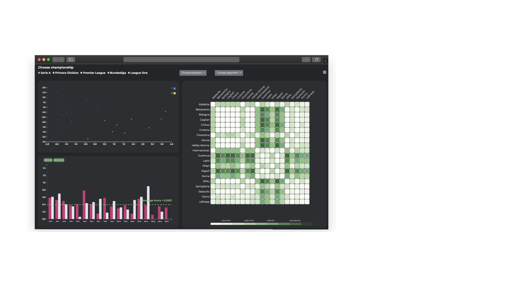
This view implements two analytical tasks (T2 and T4) described in the analytical task section. It is divided in three visualization: the teams scatterplot and the matrix giving an overview of the teams’ performance, the teams barchart allowing direct comparison between two teams.

The view in detail
Now let’s describe each component of the view, what it represents and its main functionality
Teams Scatterplot
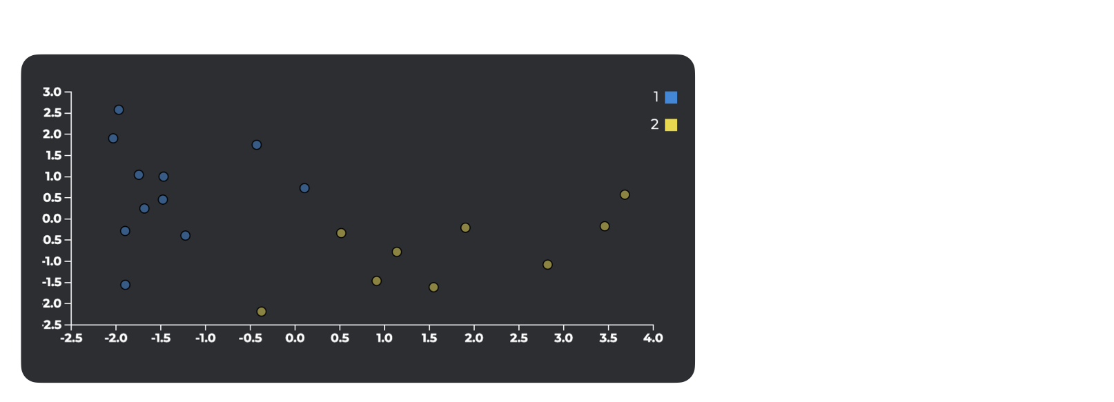
In this component each team is represented by a dot whose colour depends on the cluster it belongs to. The position of the dot in the chart depends on the results of the dimensionality-reduction algorithm (2 components) applied on the team’s attributes as explained in section III. For this reason, both x-axis and y-axis are meaningless but the user can obtain information about teams seeing their position: the closer they are, the more their performances are similar.

Matrix
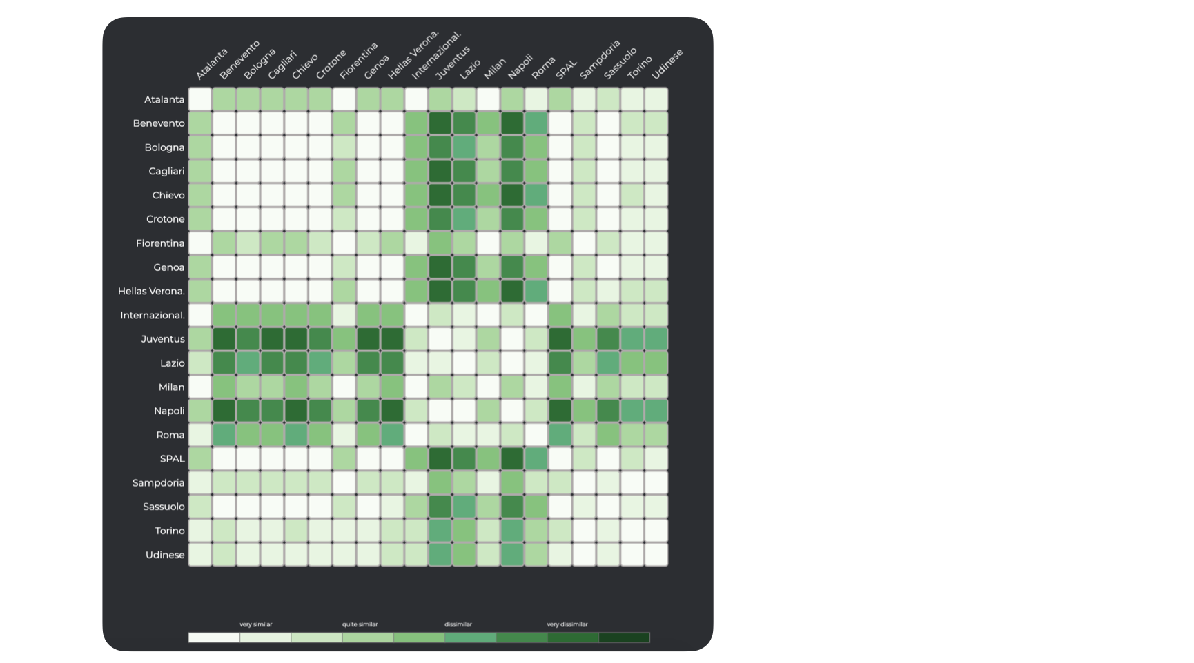
In this component the teams are represented on both rows and columns. The cell encodes the information about the dissimilarity between the teams identified by that row and column using a 9 levels green color scale.

This chart allows a comparison among teams’ performance, in particular, for each couple of teams the higher is the intensity of the green, the more they have different performance, on the contrary, the lower is the intensity, the more the teams will have similar performance.
Teams Barchart
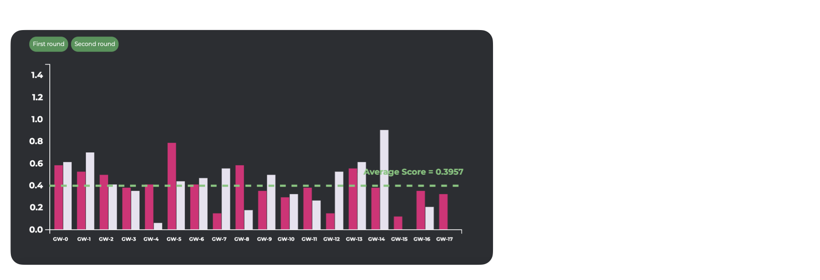
In this component, each bar represents the total score of a team in a game week. If 2 teams are selected will be shown two adjacent bars, one for each team, for the half of the total number of game weeks, otherwise, if just 1 team is selected will be shown just one bar for each game week. The second half of game weeks results is accessible by clicking on the “Second round” button.

This chart allows the user to directly compare the trend of 1 or 2 teams during the season and analyze which game week had the best performance.
Interactions among components
The components of the teams view are connected through interactions, it means that operation done on one of them triggers a change on one (or more) other components of the view.
Let’s see these interactions in detail:
-
the teams scatterplot component implements a lasso function to select groups of teams. This selection will be reflected on the matrix highlighting the corresponding name of selected teams. It also allows the user to know the complete name of a team opening a tooltip when the mouse is over the dot;
-
the matrix component allows exploiting the mouse over function on a cell to individuate the position of the corresponding teams on the teams scatterplot. Is possible to select 1 or 2 teams by clicking on a cell, it will reflect the selection on the teams barchart updating the bars. It also allows the user to know the value of the dissimilarity opening a tooltip when the mouse is over the cell;
-
the teams barchart component allows to exploit the mouse over function on a bar to highlights the corresponding team on both the teams scatterplot and matrix components. It also allows the user to know the complete name of the team and the corresponding score value opening a tooltip when the mouse is over the bar of a game week.